While pampering remains a constant in the business of personal care, a shift of people’s attitude towards wellbeing and wellness is becoming more evident than ever. The terrain in the retail services industry is undoubtedly under re-evaluation and reform to cater for the informed customer. A retail space becomes the place where people can retreat from their busy routines even momentarily, in a quest of a soothing experience, a moment of relaxation and calmness. At the same time, the rudimentary need to reconnect with nature has been gaining ground and the use of greenery within interiors is a reflection of this desire, to bring a sense of natural freshness in enclosed spaces.
-
-
-
The new approach of self-care and affinity to nature were the main focus of our research for the re-design of Flat20, a hair salon in Athens Greece. The shoestring budget proved to be a creative challenge but also the leading force behind the development of the “primitive-chic” concept.
Plant-life, natural fibers, woven textiles, honest colours quickly became part of the initial mood boards. To build the concept we have concentrated on the effective use of colour and simple materials.
-
-
-
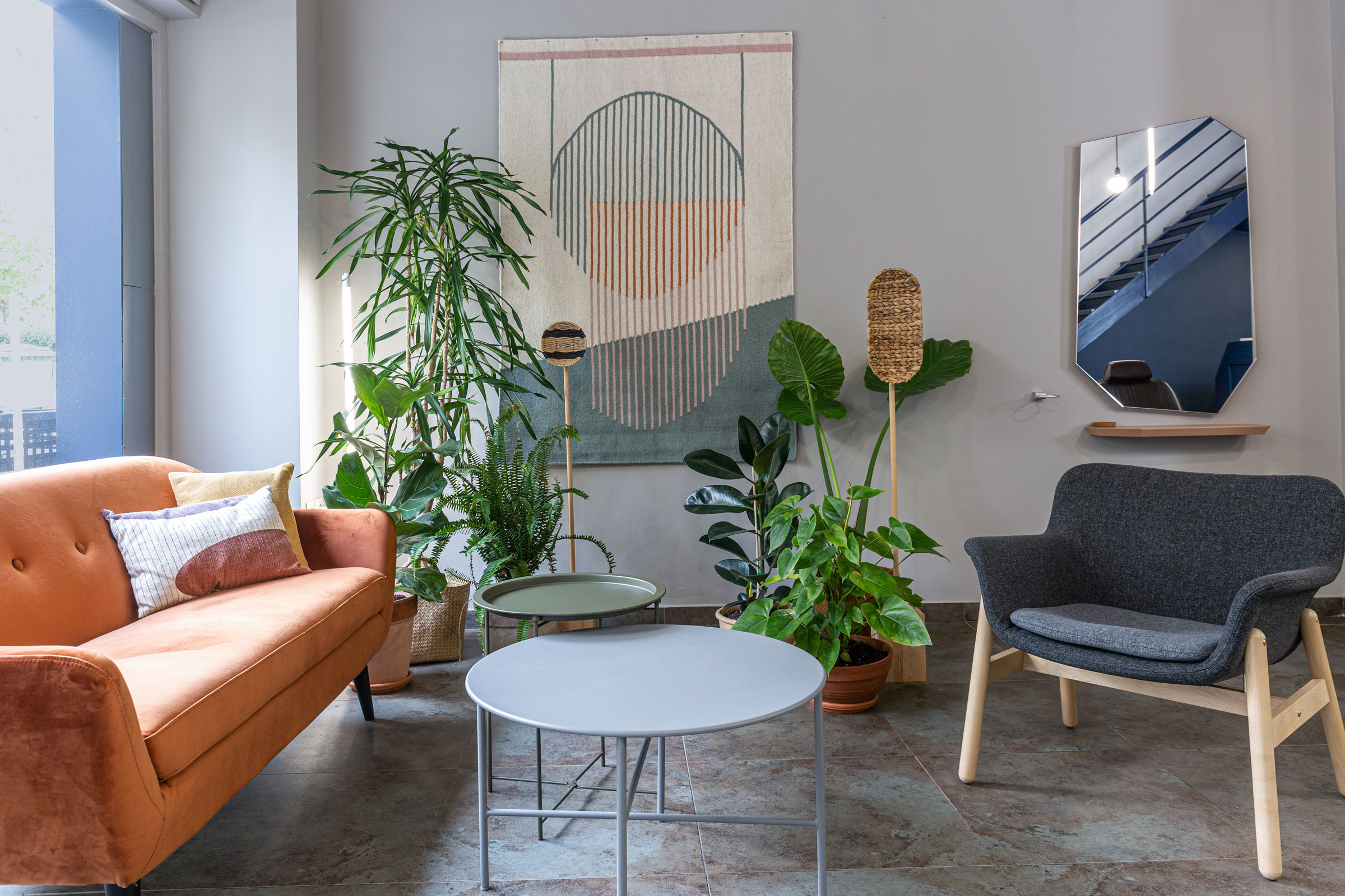
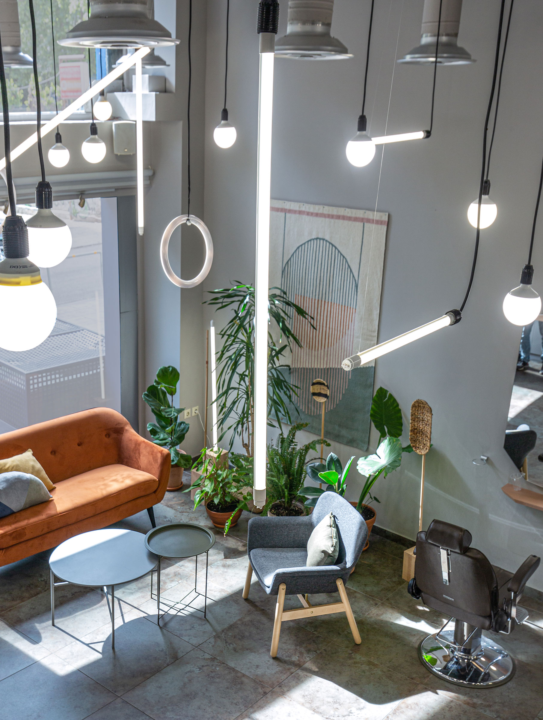
The waiting area at the front of the space, washed in the warm afternoon light creating long intricate shadows is both sophisticated and friendly. Rich velvets and crafty wools combined with natural wood and small utilitarian furniture have been chosen to create an unassuming and welcoming space.
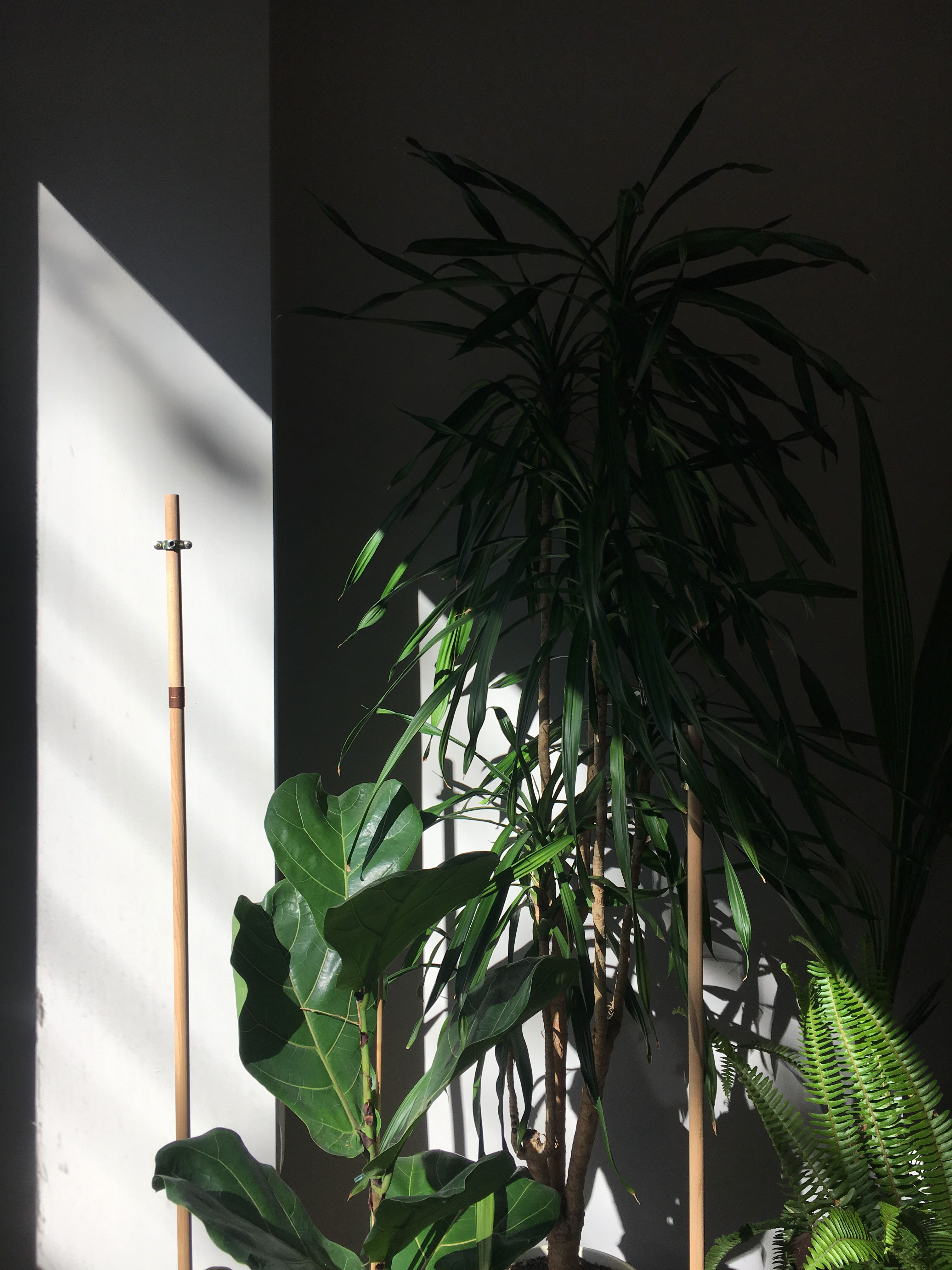
Adjacent to the waiting area a lush green corner is hosting a variety of tropical plants. Hidden in between the thriving plants a series of totem-like custom made objects, made out of wicker baskets, natural wood, and copper details await to be discovered. A large wool tapestry with simple geometrical graphics in pastel colours is hanging on the wall, softening the sounds but also visually adorning and complimenting the rest of the interior.
-
-
-
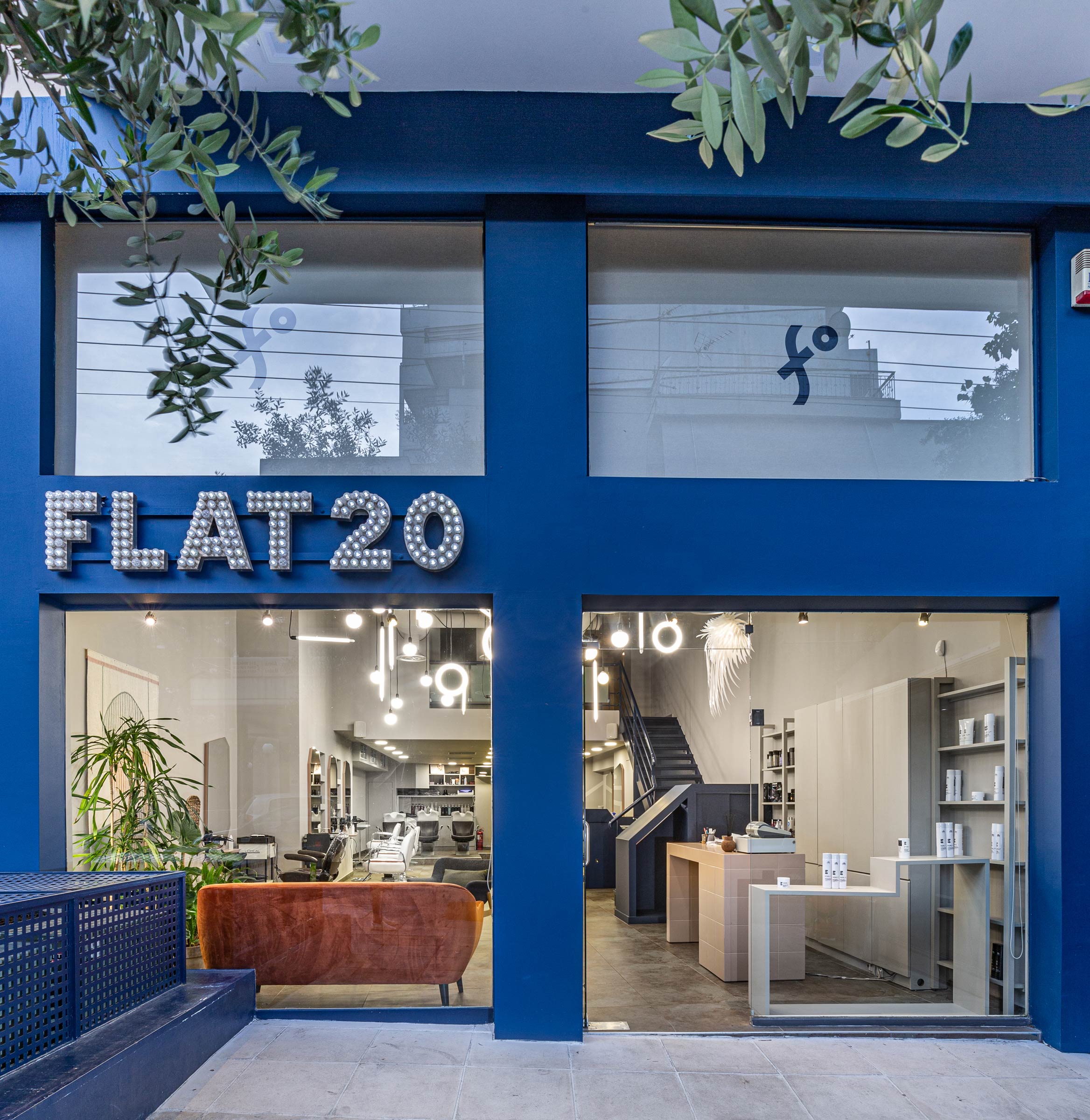
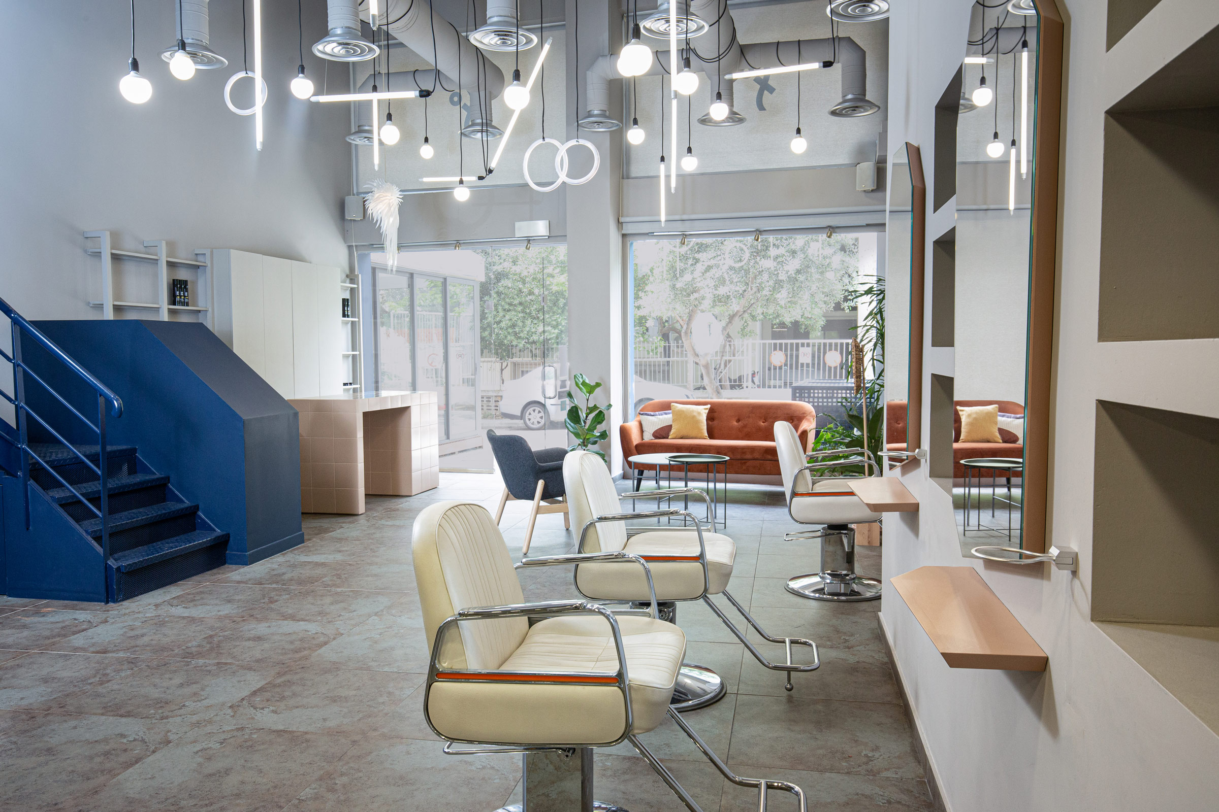
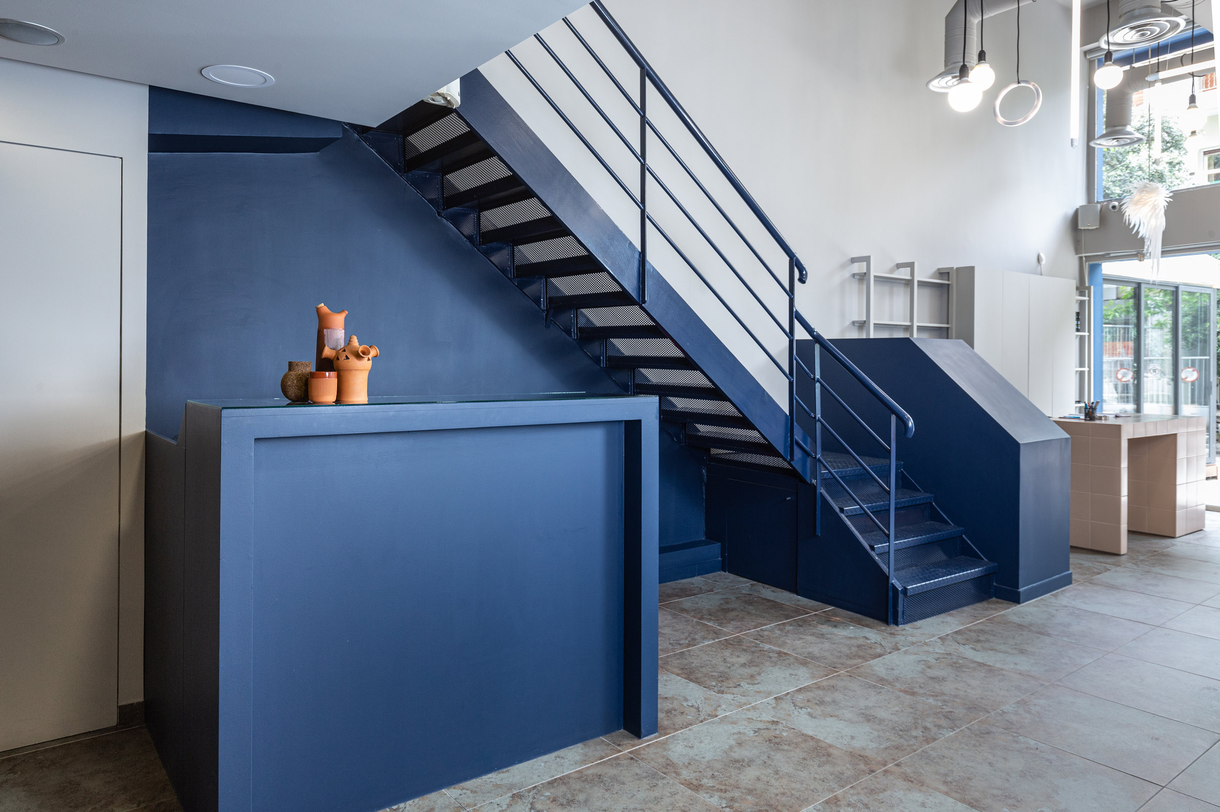
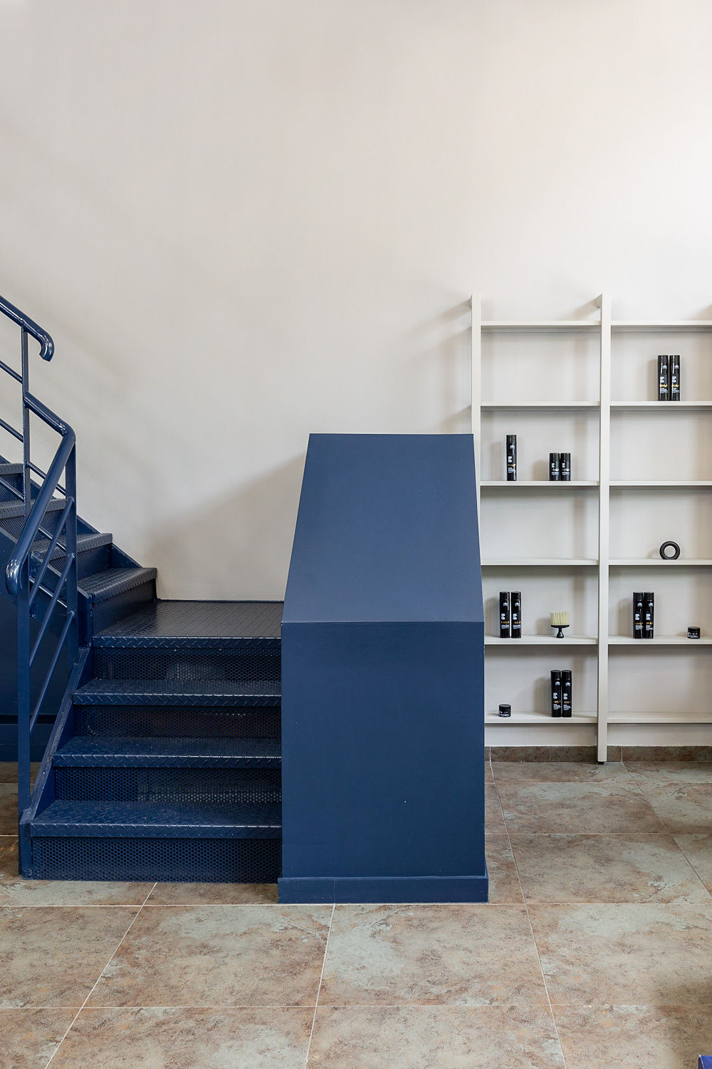
The bright, double-height space was a white canvas to create a unique light installation. This was a great opportunity to fulfil the need for plentiful light while we responded artistically to a sometimes mundane but practical feature for the space. Different light bulbs and tubes have been arranged in an organized randomness. Illuminated spheres, circles, horizontal and vertical lines are floating in space. While the whole interior is washed in a cool grey that offers a neutral backdrop for the furniture to sit within, other three-dimensional elements such as the staircase and the bar have been colour-blocked in Prussian blue to highlight secondary service areas.
-
-
-
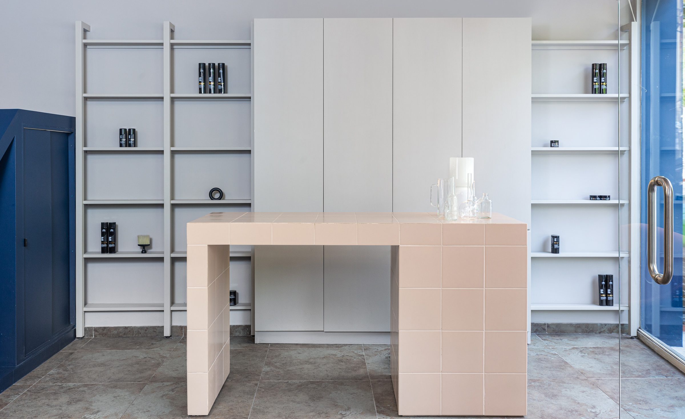
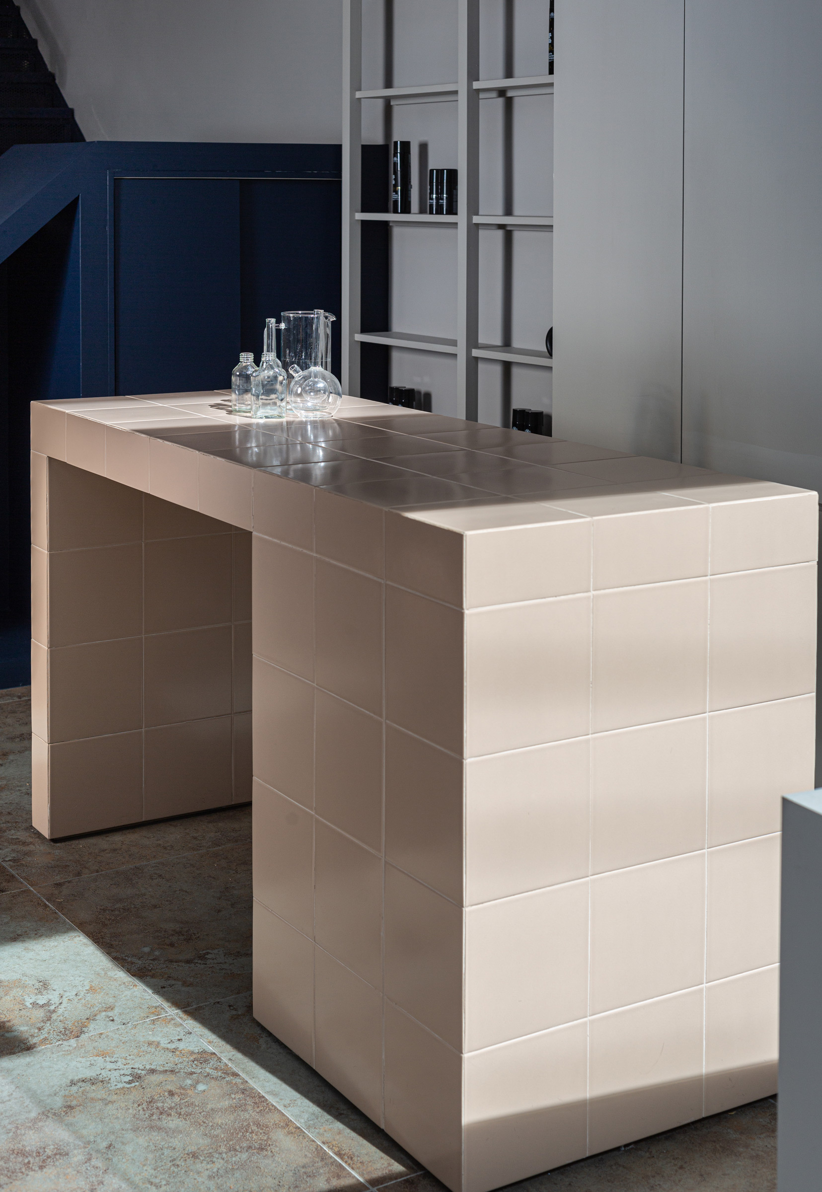
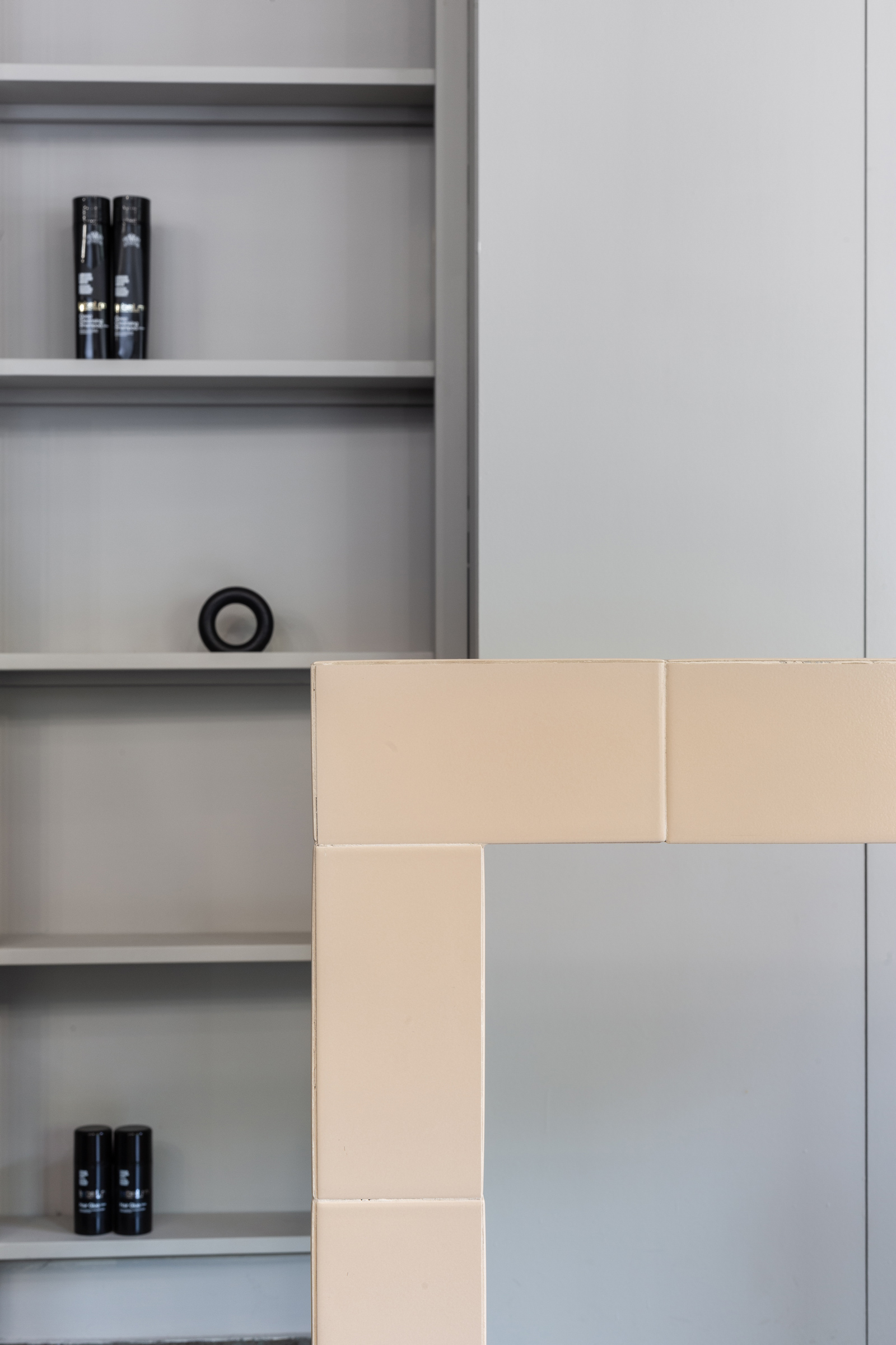
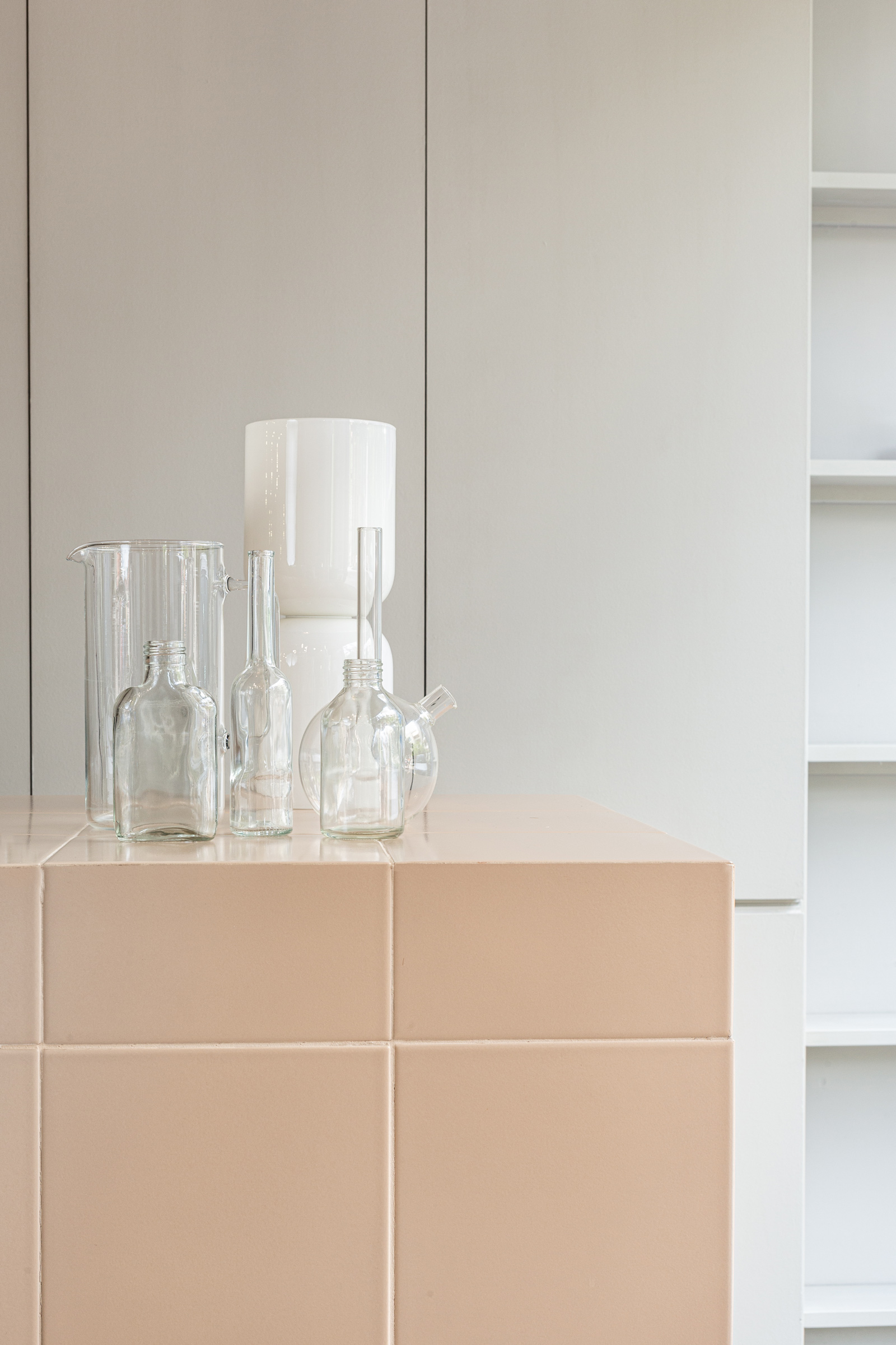
In contrast to the rich blue colour, the reception desk has been cladded in nude-pink square tiles to add texture and definition.
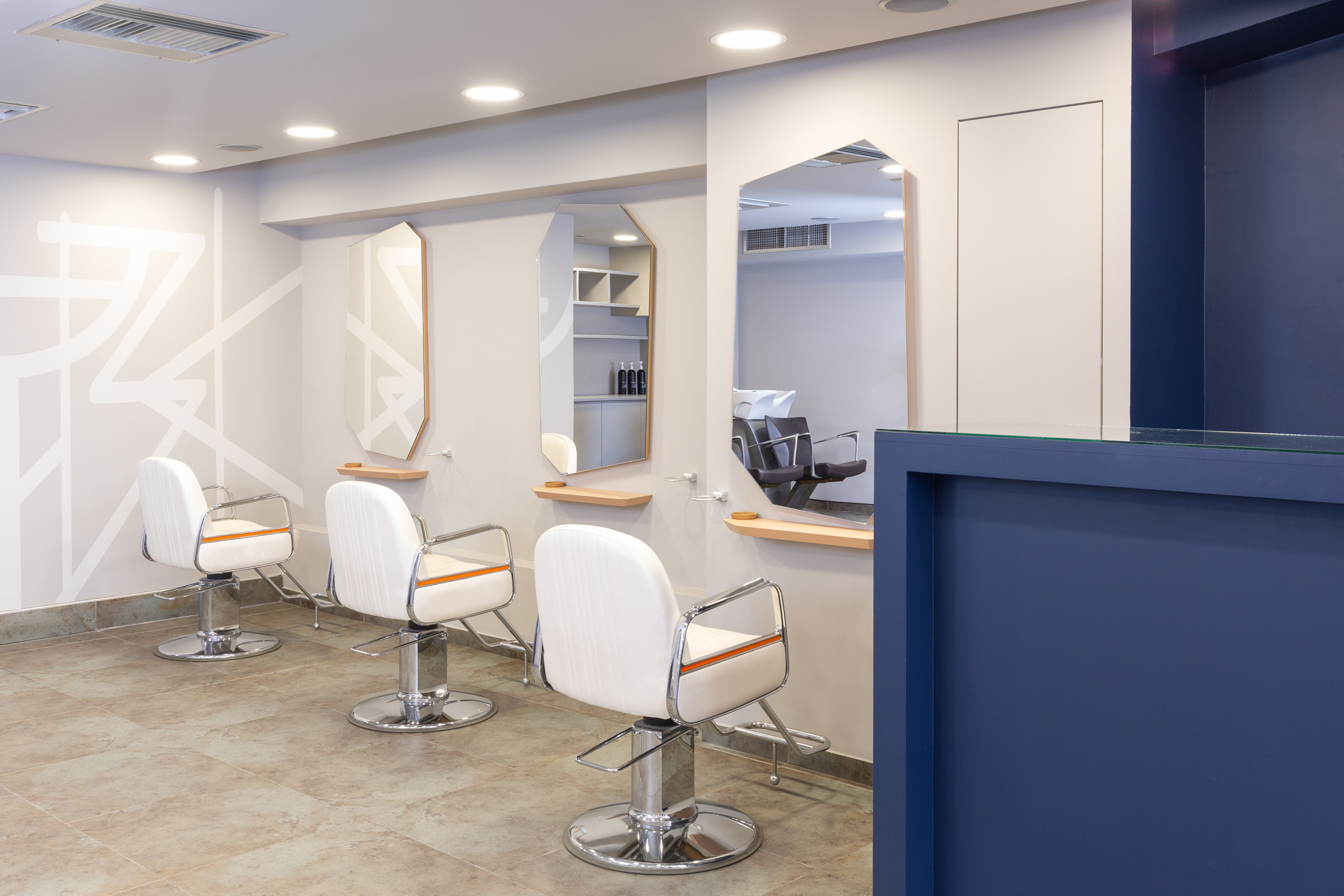
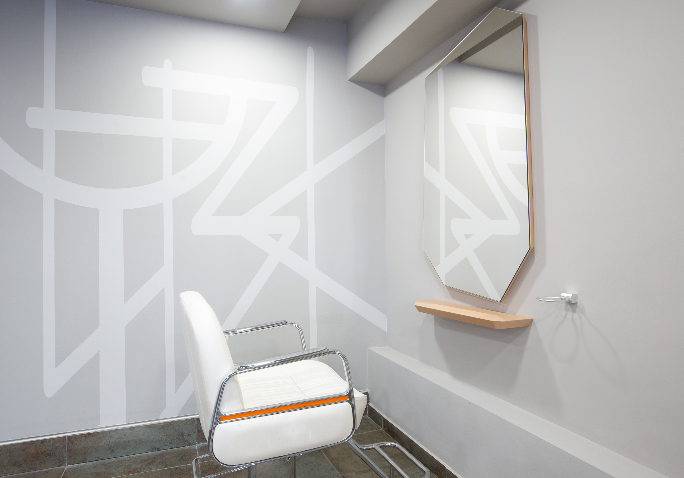
The retail unit behind the reception desk has been decorated in the same gray as the walls to blend in the background while allowing the products to be the focus. At the back of the space, a large tone-on-tone mural acts as a divider between the colouring lab and the rest of the space.
-
-
-
-
-
-
-
-
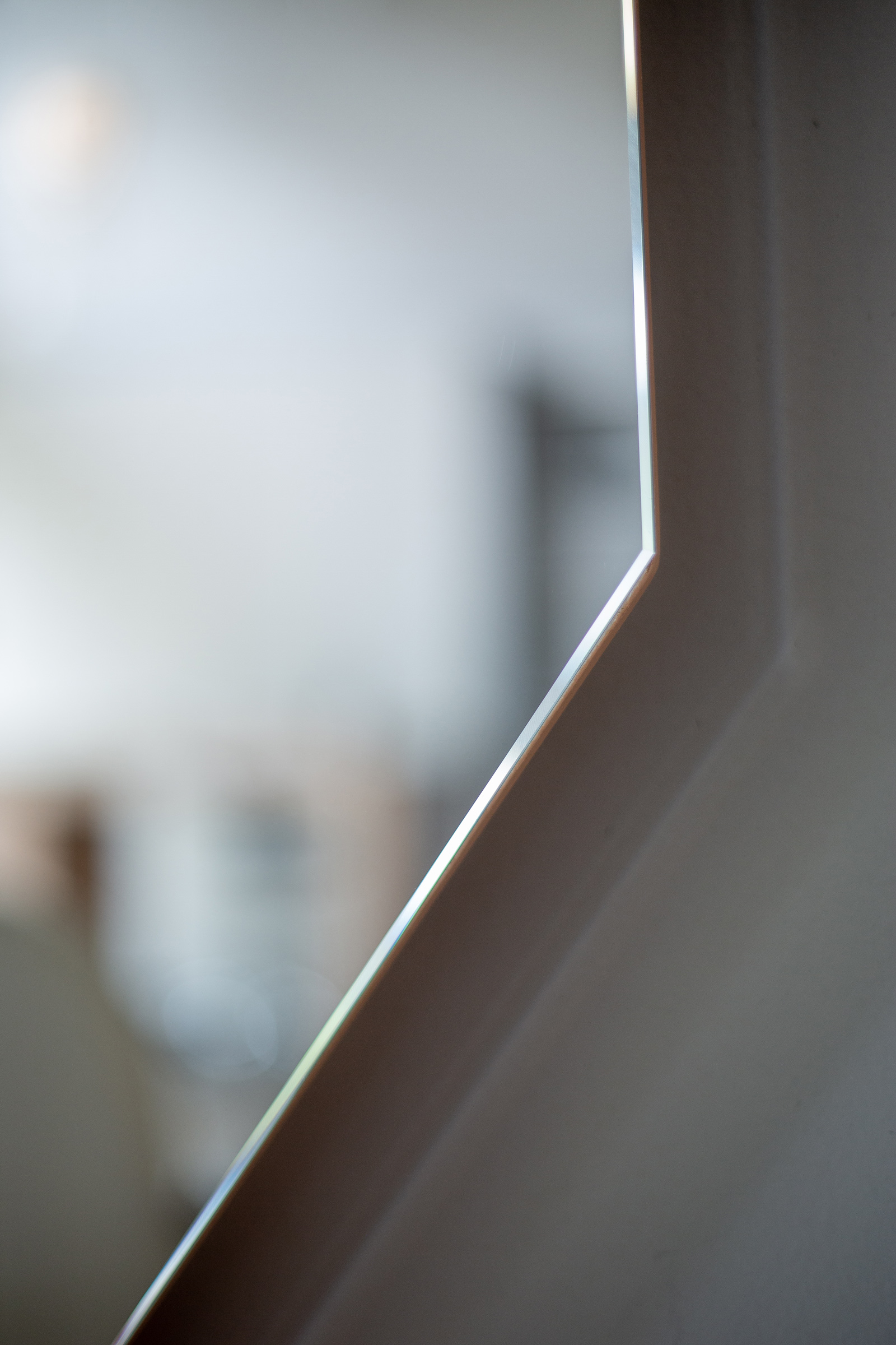
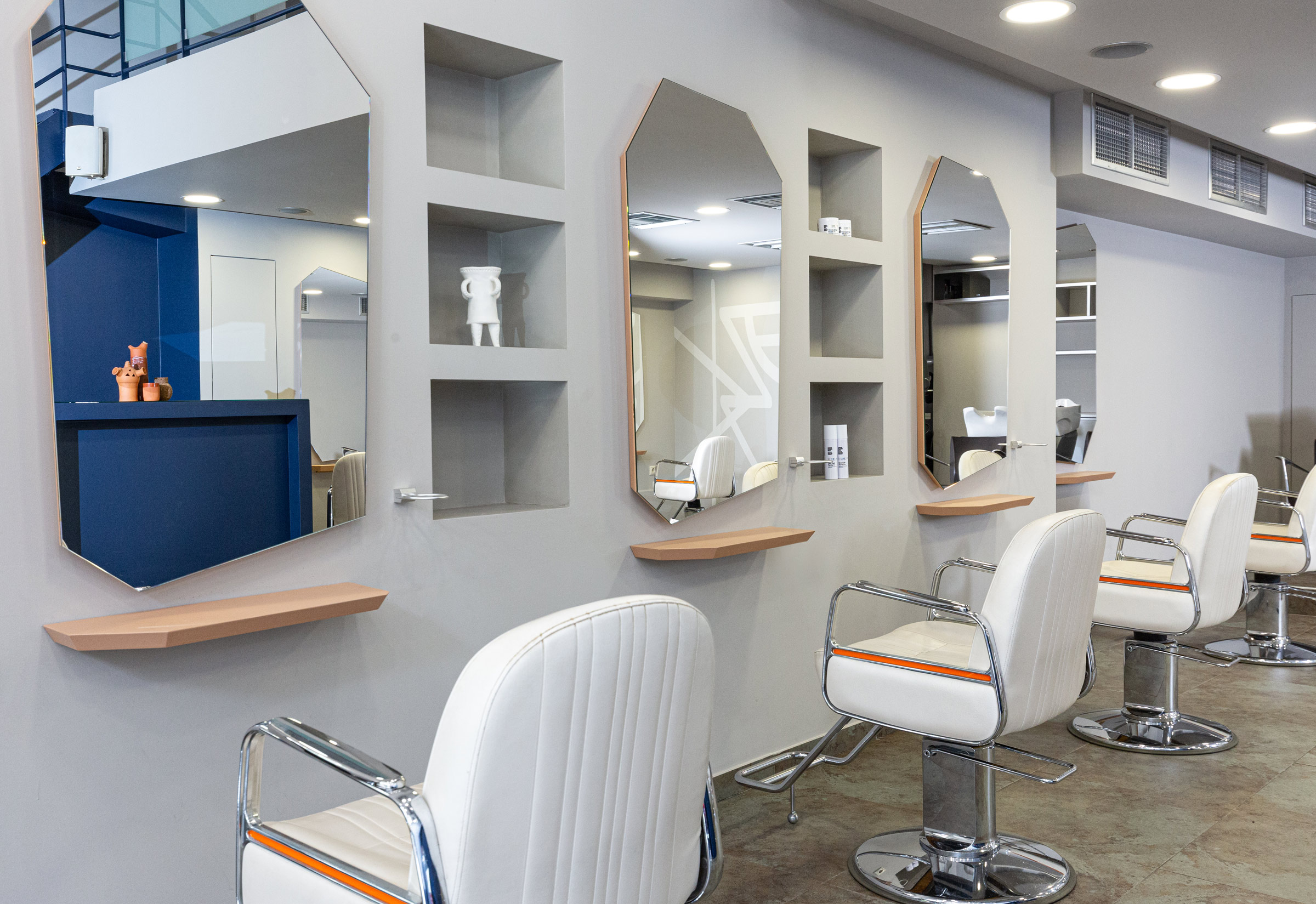
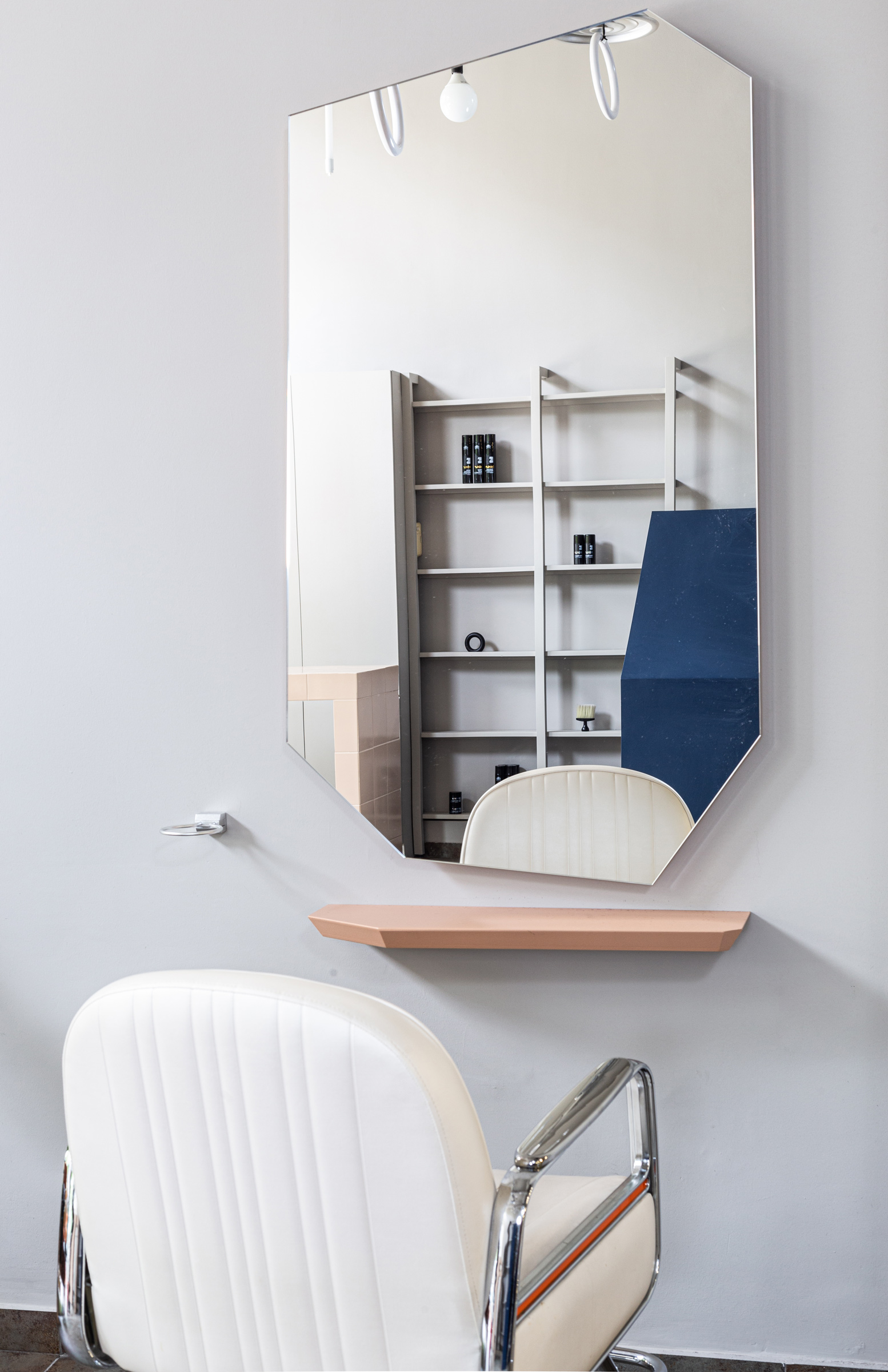
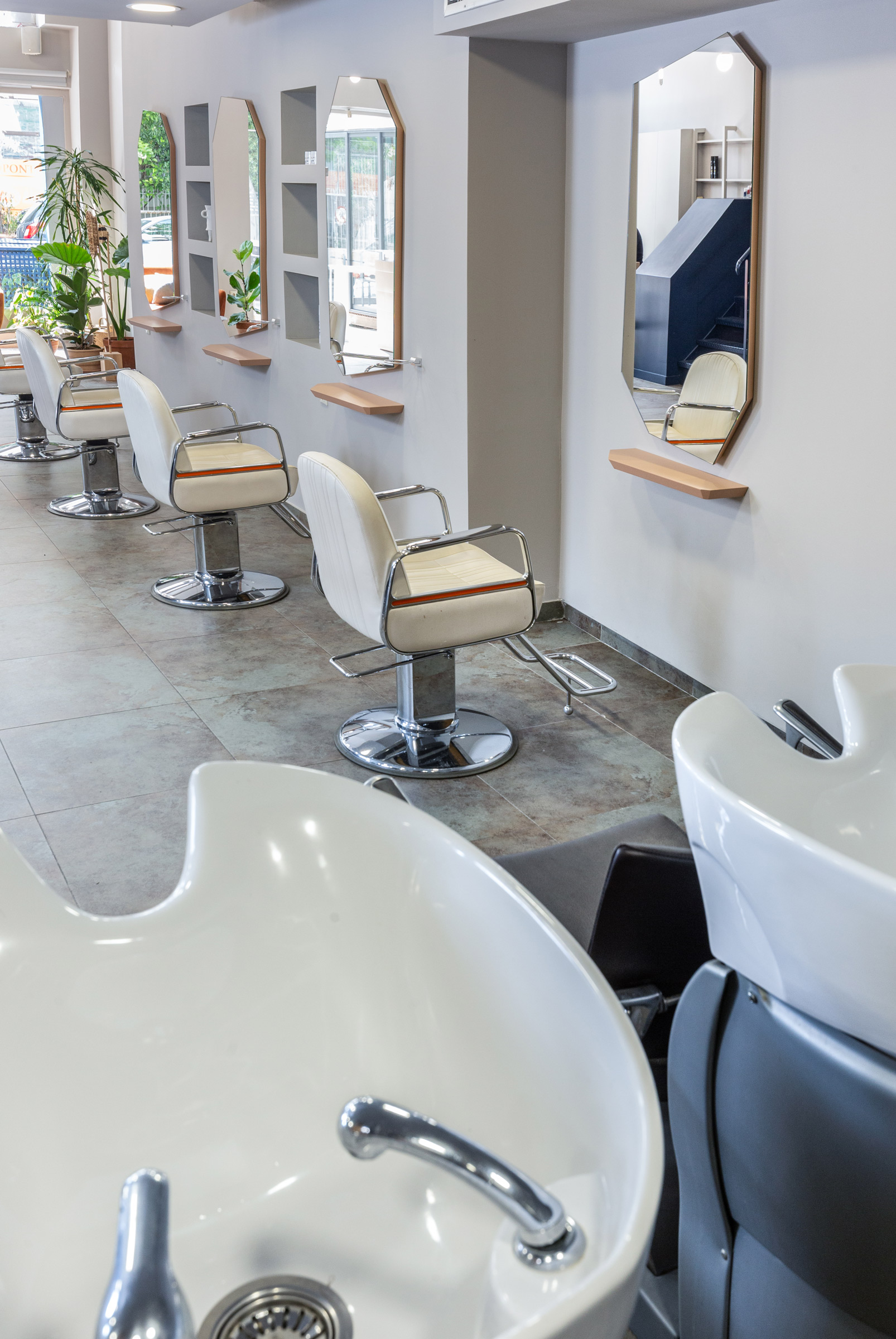
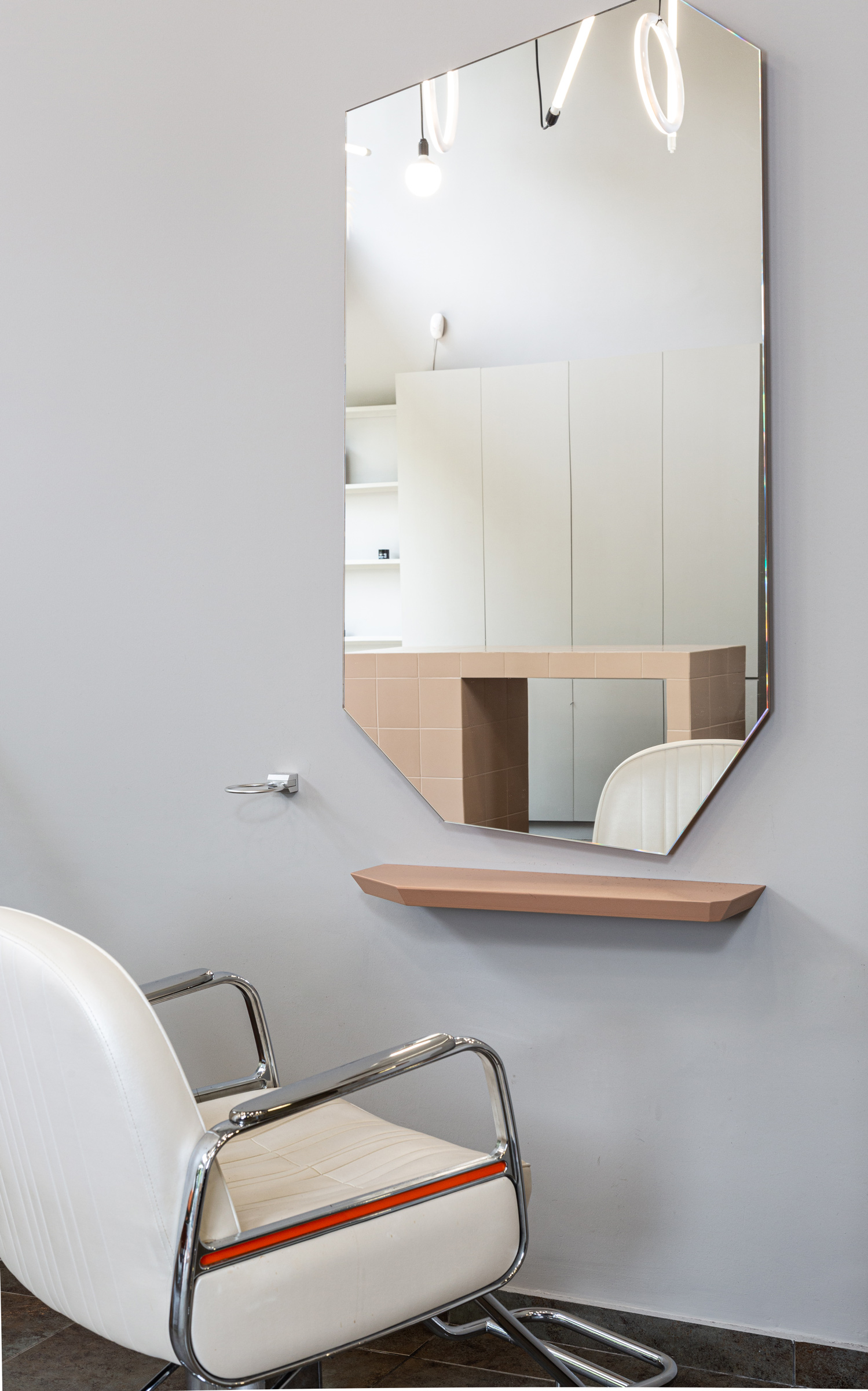
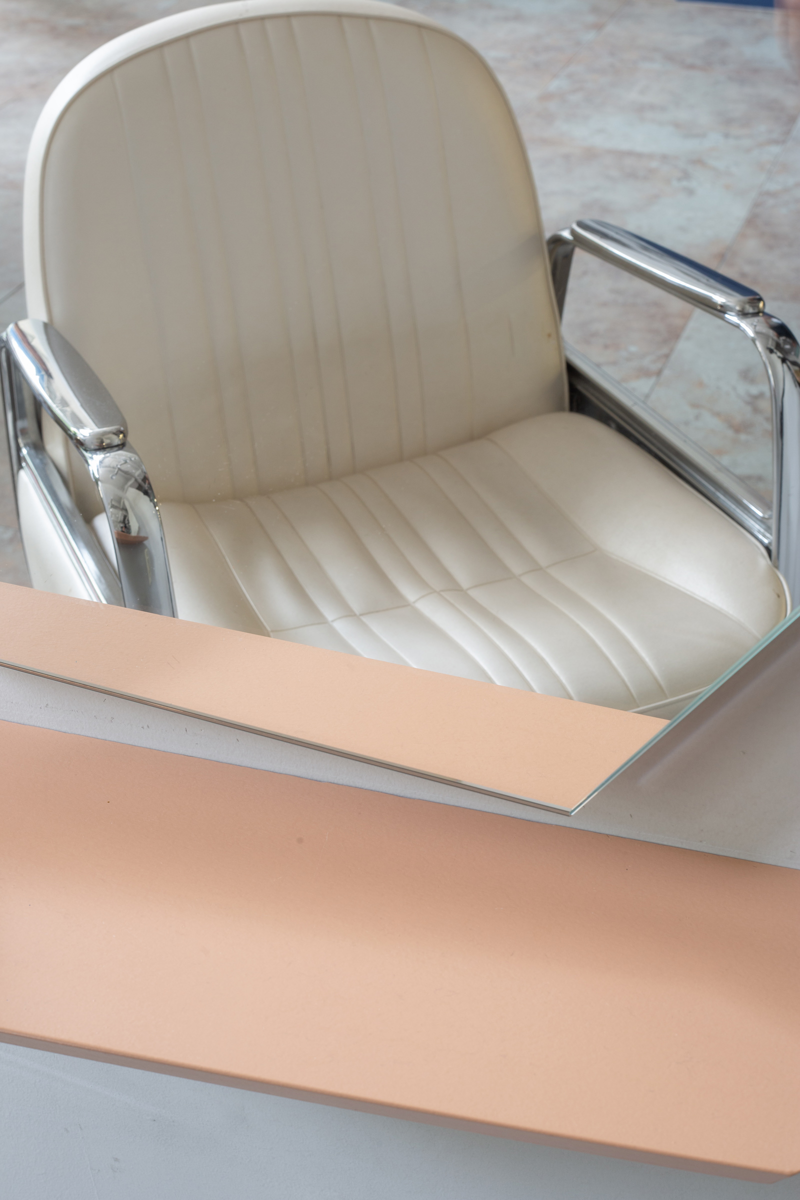
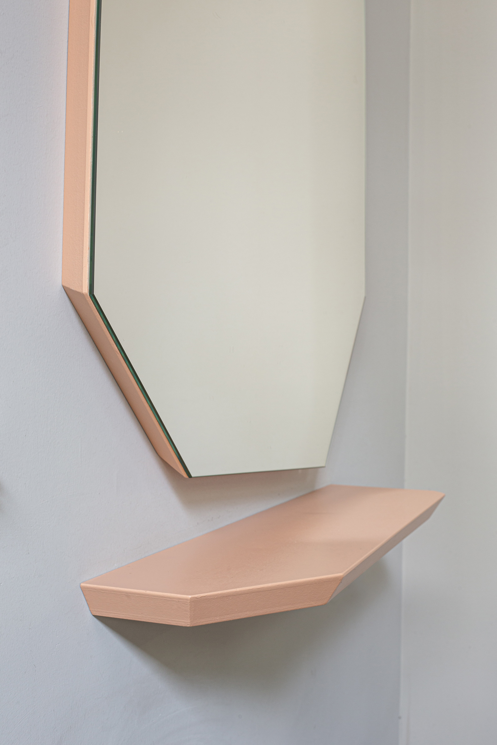
The asymmetric, faceted mirrors of the service areas have been specially designed to add depth and character.
Their fine outline has been beveled inwards, creating a soft shadow gap that offsets them from the wall and panelled with extra clear mirror to amplify the natural light into the whole space. Their irregular shape is reflecting and framing beautifully different fragments of the interior, with each mirror offering a different perspective.
-
-
-
Overall we created a space that looks contemporary/current and fresh, which felt like a natural step forward for an established business. While it was a significant transition, it does not feel detached from the essence of Flat20 as recognised and cherished by its loyal customers over the years
-
-
-
